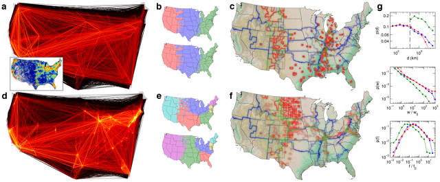
A continuing curiosity is about the geographical shapes that surface in geotagged Tweets. The images we’re sharing here use all of the geo-tagged Tweets since 2009 — billions of them. (Every dot is a Tweet, and the color is the Tweet count.)
this view of Europe, shows all the maritime traffic from different cities and countries.
Here are three favorites: Istanbul, Tokyo and New York. I like these in particular because of their uniqueness in data quality, leavened by my own qualitative taste. You can see more cities on our Flickr page.
Istanbul:
Tokyo:
New York:
Also
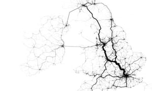
Fischer created this map using data from over one million Tweet-based trips in August 2011. Advocates of HS2 may feel somewhat vindicated. Public Domain
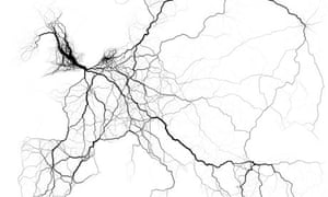
Data-mapping work by Eric Fischer suggests that geolocated Tweets be used to plan for the future. If the volume of geo-tagged Tweets is used a proxy for traffic levels, urban planners could use this data to fine-tune existing transport networks and establish where new routes are needed. Fischer took millions of geolocated Tweets from across the world, cross-referenced them with data on known transport nodes, and used the results to plot the most heavily used routes in cities, countries and continents.
He then created what are in effect transit cartograms, with the thickness of a road or other mass transport line corresponding to the volume of Tweets sent along its path.
Below is a selection of the maps he produced. The full series of images can be found here at Fischer's Flickr account.
British Isles
Fischer created this map using data from over one million Tweet-based trips in August 2011. Advocates of HS2 may feel somewhat vindicated. EuropeUsing data from Twitter covering 60,000 trips, aggregated within a ten mile radius, Fischer created this map of Europe's transport network. He acknowledges that disproportionately high Twitter usage levels in England and the Netherlands has skewed the overall picture.
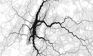
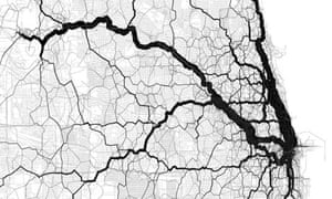
New York City
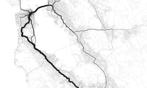
Broadway shows clearly as the most heavily used route, with subway networks also well-defined. San Francisco Bay AreaTrips across the bay and along the peninsula dominate, though aggregation radii make it difficult to know exactly which road or rail line was being used.ChicagoTheChicagomap was made by plotting ten thousand Twitter-sourced points over an OpenStreetMap grid. Fischer points out that the thicker line heading to the southwest doesn't correspond to any major road or rail line.
_______________________
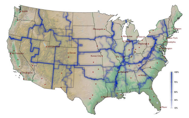
To theoretical physicist Dirk Brockmann, the borders of the United States are out of date.
"Some are kind of arbitrary like New Mexico, Arizona: They’re just kind of drawn on the map," says Brockmann. "Often, they no longer correlate with our behavior." Specifically, they no longer correlate with how we move.
Brockmann was doing research on human mobility in 2005, and struggling to find useful sources of data, when on the way back from a conference in Canada, he stopped by the home of his old friend Dennis Derryberry in the Green Mountains of Vermont. Derryberry asked: "Do you know about WheresGeorge.com?"
You can think of WheresGeorge.com as a primitive FourSquare for $1 bills. "Georgers"—as users call themselves—"check in" their bills by entering the zip codes and serial numbers, then write or stamp "wheresgeorge.com" on the bill. If someone finds the bill and enters it again, they get a "hit." The top Georger—an ammunition dealer who goes by the handleWattsburg Gary—has entered more than 2 million bills and has nearly half a million hits.
This was, according to Brockmann’s account, the beginning of "Where’s George?" research: "Forming a mental image of millions of these dollar bill journeys in my head, I was convinced that analyzing this data would reveal essential properties of human mobility, the driving force behind the dispersal of bank notes."
Brockmann has, in fact, used the dollar bill data to reveal certain "essential properties" (specifically, that our travels follow a Power Law), and also to model the Swine Flu epidemic. But one of his coolest research projects is his work on "effective boundaries."
Brockmann took data for how the dollar bills traveled, and used network theory to draw lines where dollar bills are less likely to cross. In places they follow state borders, but not always; Missouri is divided into East and West, as is Pennsylvania. The "Chicago catchment area" includes a big chunk of both Indiana and Wisconsin.
The resulting map shows how "effective communities" don’t necessarily follow state lines. "I don’t know so much about the culture of the U.S.," says Brockmann, who grew up in Germany. "But when I give talks on this, normally someone in the audience says, 'Oh, this makes perfect sense."
more imagery : http://www.fastcoexist.com/1681677/a-new-map-of-the-us-created-by-how-our-dollar-bills-move

 New York:


No comments:
Post a Comment